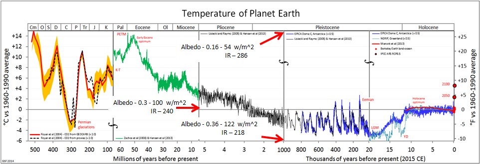
This temperature plot is really an IR and ALBEDO plot. See the spread sheet on the next page. The Albedo of the most recent time is about 0.3, based on what the consensus people, and others tell us. We know that albedo is higher in cold times and is lower in warm times. The consensus people tell us that is a result of warming and cooling that is caused by CO2 and orbit changes. They really do not have data for CO2 and orbit changes that could cause much of the temperature changes. They can match little pieces, here and there, but nothing impressive. They use the Albedo feedback to make up the difference. It is really the cause.
Using current values for Albedo as 0.3, Solar in as 340 w/m^2, Temperature as 288 Degrees K and IR out as 240 w/m^2, the max and min temperatures on this chart can be used to calculate Albedo and IR out for the max and min temperatures.
Replace the temperature scale on this plot with Albedo and IR. and you can explain climate temperature changes. We know Albedo is less and IR is more when temperature is higher. We know Albedo is more and IR is less when temperature is lower.
I conclude that temperature went up and down because of Albedo changes.
This does agree with Ewing and Donn and Wysmuller and Pope Climate Theory.
The Albedo change necessary to take the Medieval Warm Period into the Little Ice Age was only 2%.
I did get get the chart above from Posting by Sturgis Hooper on wattsupwiththat, but the links have changed. I added the IR and Albedo to the chart.